top of page

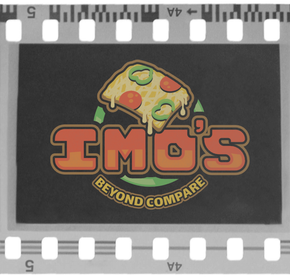
A rebrand for the loved and famed St. Louis pizza chain, Imo's Pizza.


I spent a few weeks researching the history and focus of Imo's Pizza. I then built up concepts that would be appropriate for the brand, giving their logo more excitement/enticement and putting more focus on what makes the company unique, their square cut pizza with gooey Provel cheese. I wanted to make a logo that would fit into the streets of both the city and suburban areas, while still standing out and grabbing your attention.


bottom of page


